
raul diaz reyes_ vocabulary to fix vertigo
jun 15 - 17 aug_2019
the color of the vowels
“I invented the vowel color! – A black, E white, I red, O blue, U green. I regulated the shape and movement of each consonant, and, with instinctive rhythms, I boasted of inventing a poetic verb accessible, sooner or later, to all the senses. I reserved myself for translation. At first, it was just a study. He wrote down silences, nights, he wrote down the inexpressible. It fixed vertigo.” Arthur Rimbaud[1]
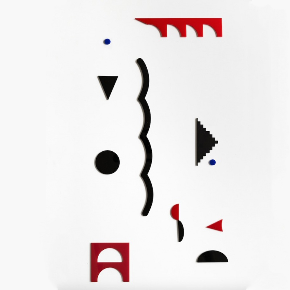
Raúl Díaz Reyes fills the four walls of the exhibition room with an alphabet of colors and shapes. In his second solo show in São Paulo, the Spanish artist spreads small two-dimensional acrylic elements across the space. Largely geometric, the blue, black, and red pieces are not letters themselves. They are born from the meeting of pure shapes, triangles, circles, and squares, in a process of addition, cutting, and subtraction that gives rise to new configurations. Others are more spontaneous and gestural. Together, they constitute a vocabulary of signs that sometimes refer to known and quickly identifiable designs, close to icons and logos, to the urban universe, and to advertising.
Accompanied by their supposed “molds”, at first glance it seems that the pieces have just conquered their freedom, still timidly and slowly. The molds – cut acrylic sheets, framed and supported by rectangular painted iron structures – resemble those hollow rulers, with typologies of simple shapes, with which it is possible to sketch trees, planes, or even ocean waves. They also recall architects’ rulers, who used to build technical drawings, less playful, which respond to the functionality and logic of prefabrication. However, contrary to the first impression, the loose and smaller figures do not fit into the voids of the molds, which indicates that in reality, the larger pieces did not work as production matrices. This disconnection is the first sign, or the first clue, of the disruption of order and entropy suggested by the artist.
Laser-cut, the acrylic elements allude to industrial production. Its corners are alive, its matter is cold and its surface is delicate. Manual work seems far away. Even so, the dialogue with the experimentation of the historical vanguards, with geometric abstraction, constructivism, concretism, and neo-concretism is clear. Like Mallarmé’s typographic poem, “Un coup de dés ever n’abolira le Hasard” (1897)[2], which explored the possibilities of printing technology and the emptiness of the page, Raúl’s pieces use the wall like a sheet in white. The cut-out figures stick to the architecture and define the pace of reading and the pauses in the work. Freely grouped, the pieces establish weight balance games that escape a fixed rule, a single pattern, or grid. The ensemble has movement and draws in space a score made with an alternative musical notation, a visual poem, or a landscape. It doesn’t seem easy to decipher its meaning or its construction laws. The reading of the installation transits between the visual, the choreographic, the architectural, and, despite the silence, the sound.
In a 1965 text, “Between Poetry And Painting”[3], the Benedictine monk and visual poet Dom Sylvester Houédard uses the terms “logos” and “icon” to refer more broadly to the “word” and “the painting”. When building a historical chronology of the relationships between the two concepts, from primitive artifacts to the 1960s, the monk proposes terms such as “quasi-painting”, “quasi-word” or even “quasi-letter”. Using this terminology to designate open proposals that are in permanent redefinition, Dom Sylvester undermines the nature and existence of “words” and “painting” as stagnant materials, proposing areas of free circulation and non-separation between text and image, between poetry and painting, between “logos” and “icons”[4].
Raúl’s pieces can be found in this terrain, “between”. They are quasi-paintings, quasi-words or quasi-letters that synthesize and materialize signs present in contemporary visual culture, city signage, and art history. In this work, references or contaminations are crossed without explicit and specific citations from different times and origins. From the production of American graphic designer and filmmaker Saul Bass, famous for opening films like “Vertigo”, by Alfred Hitchcock, to the geometric choreography of Oskar Schlemmer’s “Triadic Ballet”, from the beginning of the 20th century.
Some of the elements of the installation also recall the totemic iconography of Rubem Valentim, who from the 1950s onwards appropriated the language of geometric abstraction to build complex compositions that redesign and reconfigure Afro-Atlantic symbols, emblems, and references. Finally, it is essential to refer to Lygia Pape, to her Ballet Neoconcreto, conceived in 1958 in partnership with the poet Reynaldo Jardim, and, mainly, to the trilogy of books that the artist produced in the late 1950s, early 1960s, Book of Creation, Book of Architecture and Book of Time.
Lygia transcended the formal distancing of concretism, drawing attention to the social dimension of art and suggesting the interaction between art and the public. Raúl also questions pre-established orders and proposes processes of articulation, reconfiguration, and metamorphosis that take place in front of the spectator. Like Rimbaud, he invents his own vocabulary to fix vertigo.
Isabella Lenzi
__________________________________
[1] Rimbaud, Arthur. “Une saison en infer. Delires II. Alchimie du verbe”, 1873.
[2] In Portuguese: “A throw of the dice will never abolish chance”.
[3] Houedard, Bishop Sylvester. “Between Poetry And Painting”. London, ICA -Institute of Contemporary Art, 1965.
[4] thank you Tomás Cunha Ferreira for the bibliographic reference and for the ideas on the text.